Building a Website Through Process & Analysis
Sector: Government, Public Sector
The Challenge: The government council had a very unclear navigation on their website with complex workflows that hindered user experience. The website needed to be optimised to improve content accessibility and reduce user frustration.
My Role: UX/UI/Web Designer
Achievement:
Reduced information search time by 40%, enabling employees to find resources faster by reducing the number of clicks.
Reduced HR/helpdesk support queries by 80%, as users found answers independently.
Achieved 90% adoption rate, with employees actively using the new intranet within the first three months.
Analysis/ Research and Survey Result– To understand user needs, I designed and distributed surveys to gather insights on behaviours, preferences, and pain points, particularly in navigation and overall experience. Analysing the results revealed common challenges, like difficulty finding information or navigating complex menus. These insights guided design improvements, ensuring a more intuitive and user-friendly website.


Market Research – I conducted in-depth research into industry standards, best practices, and competitor websites to identify how similar challenges were addressed. This included evaluating how other platforms presented large amounts of information and the various tools and features they employed to make it easier for users to access content. I also explored user feedback from other platforms to understand what worked well and what didn’t, ensuring that our approach was informed by real-world examples.


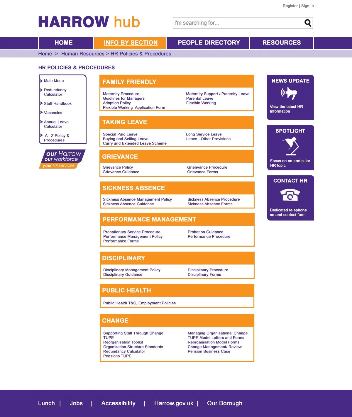
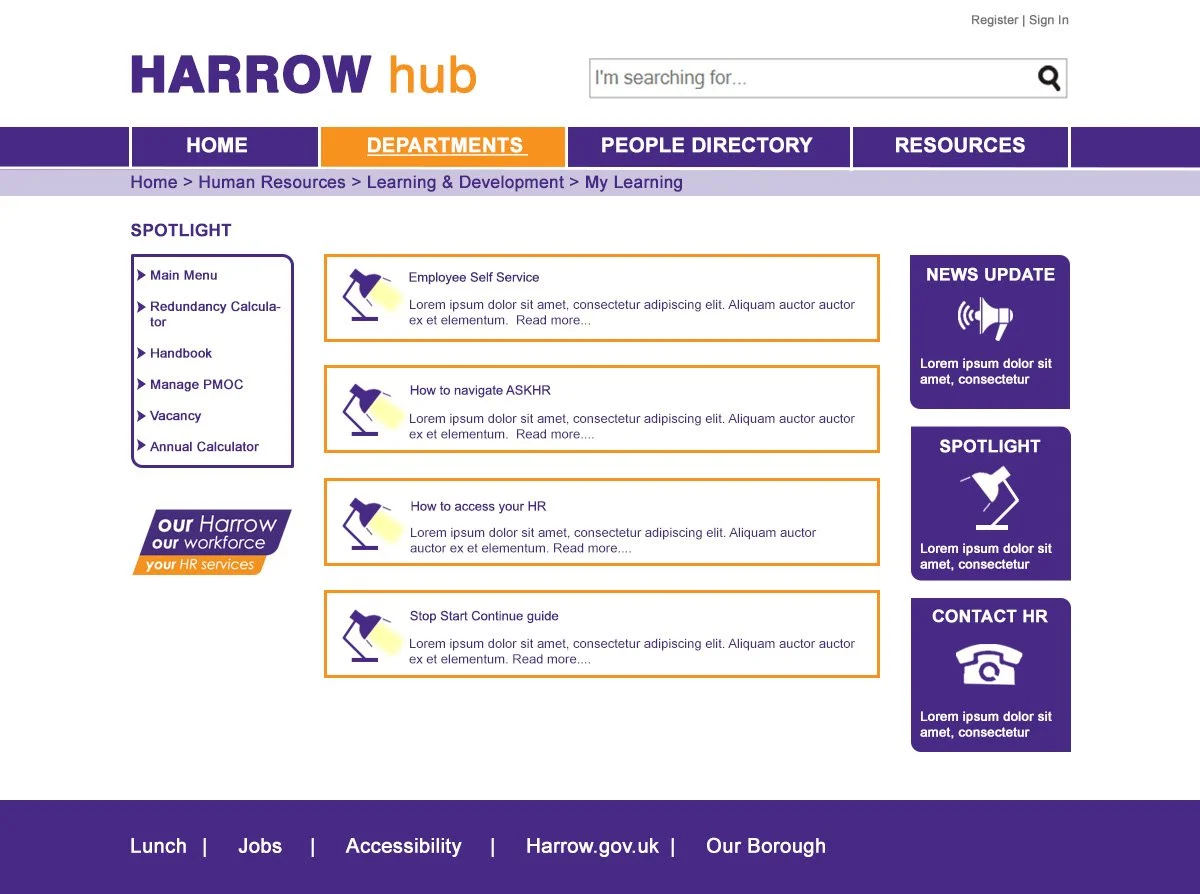
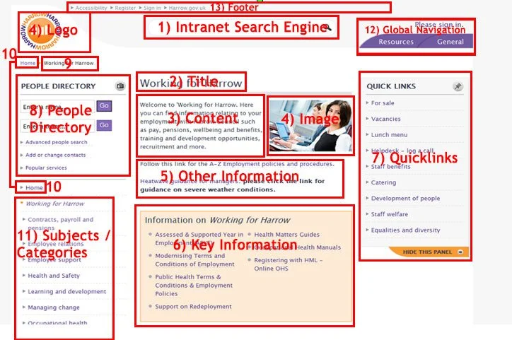
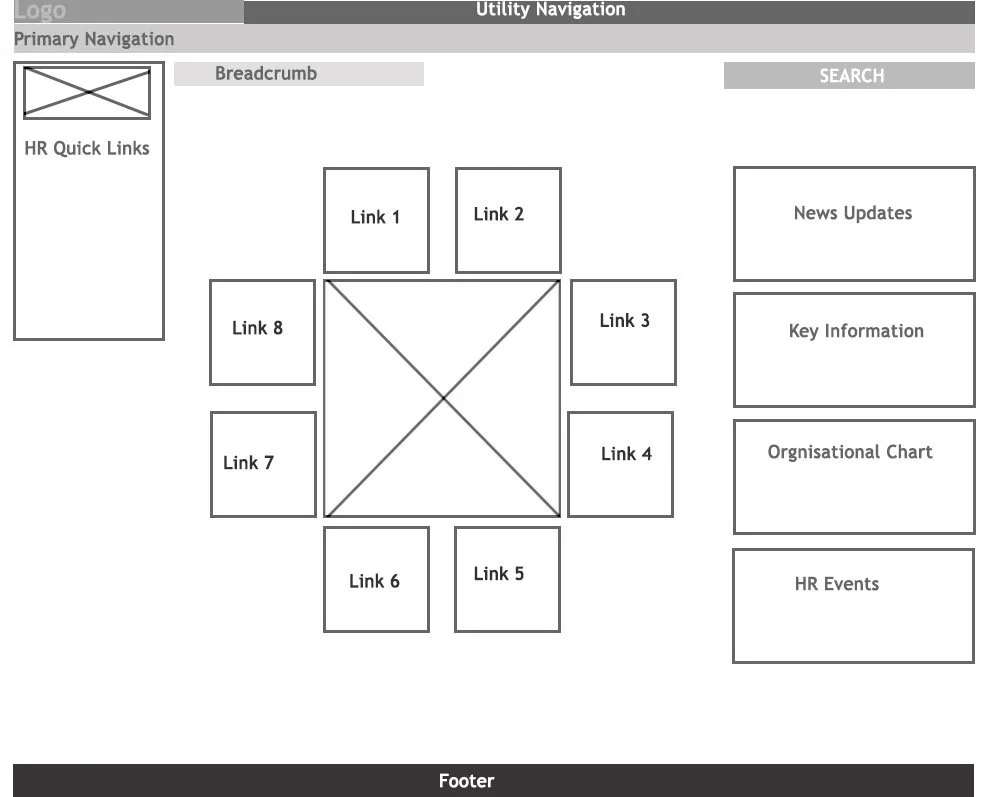
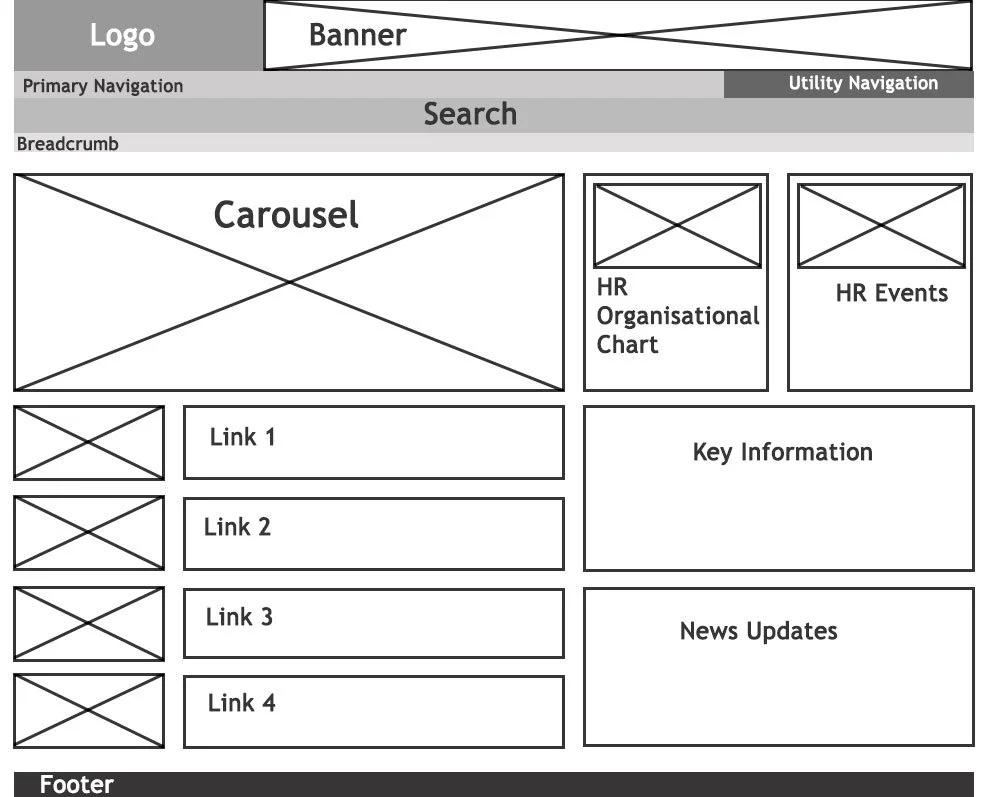
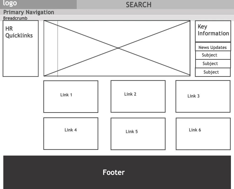
Wireframing & UX Design – I worked closely with designers, developers, and content strategists to define the project scope, prioritize features, and align on user goals. This collaboration ensured a shared vision and incorporated diverse feedback for a stronger design. Using insights from research and teamwork, I created wireframes to map the website’s structure and user flow. These wireframes simplified navigation, ensured clear information hierarchy, and served as a blueprint for development.
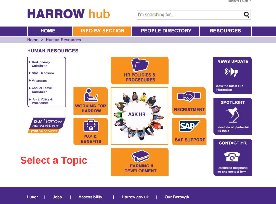
Designed Icons & Visual Elements – As the wireframes took shape, I started designing custom icons and other visual elements to complement the overall user experience. These elements were carefully crafted to be visually appealing, while also enhancing usability. The icons helped communicate functionality and content quickly and clearly, reducing cognitive load for users and making the website feel more polished and engaging.

Usability Testing, Implementation & Accessibility Testing – I designed interactive prototypes to test the user experience, gather feedback, and refine the design through usability testing. After stakeholder approval, I collaborated with developers to ensure proper implementation, focusing on functionality, responsiveness, and accessibility. Once built, I conducted thorough accessibility testing to meet WCAG standards, assessing color contrast, font sizes, keyboard navigation, and screen reader compatibility. Necessary adjustments were made to create an inclusive, user-friendly platform.
The Launch & outcome – The new website greatly enhanced how users accessed information, making it quicker and more efficient. With a streamlined design, improved navigation, and an emphasis on user needs, the website led to a more engaging experience, boosting user satisfaction and interaction. The project successfully met both the user and business goals, improving overall performance.